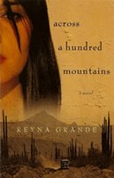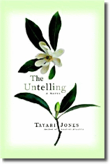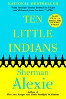


So I have a new novel that's in the production pipeline at Kensington. Right Side of the Wrong Bed, a novel, will be published in Summer 2007.
Yeah, it's a slow process. Shared that already. If you're a writer, know that it takes about a year to 18 months from contract signing to actual book on store shelves. It's time well spent.
So, we're in the preliminary stages of thinking book cover design... my agent, publisher, and I. And of course the talented artists at Kensington.
But I wanna know from you... what types of covers usually draw you in? Bright colors or subtle hues? Live models shots or color illustrations? People? Faces? Objects? Just the title and author name? Have you ever bought a book, or at least picked it up, on just the cover alone? What are some book covers that STILL stand out to you after all this time? Covers that you'd even want reproduced as artwork in your home?
I know all the folks I work with will have their ideas, market research, and such to back them up on. But I also wanna hear from you... readers who read this blog or have read my first novel, Down For Whatever.
Oh, and of the novel covers pictured in this entry, what works for you? We're not going negative... I just wanna know what works in a positive way for you.
fs


2 comments:
Hey Fred--glad to see your back & that you had fun.
A cover for me has a lot to do with the weight the novel carries. I have to say that I do judge books from its cover if I am not familiar with the author. If it's literary fiction, then flashy doesn't do it for me. I love, for example, the new Toni Morrison reprints whose cover consist only of the title and her name. It intrigues by not drawing in on false pretenses.
On the other hand, for fun novels I like fun covers. I love Rashid's cover, it's simple but artistic and personal. And very African American, if you will. Alexie's cover as well, but he is already established. As long as his name is big enough to read from 10 ft away he is good. I like the cover for 'The Untelling', simple and delicate and hints at growth.
The cover for 'Down for Whatever' was good as well.
Hi Frederick!
I like artistic covered book covers. I'm sure you'd know I'd say that. I like the Lazarus cover and accross a hundred mountains. I like the mystery of a book before I pick it up. They cause you mind to guess what the book is about before reading it...and usually just suggest an emotion. The name of the book and author should be bold as well.
Post a Comment